Typography - Task 3
Denise Anjali // 0342430
Typography // Bachelor of Design in Creative Media
Task 3: Type Design & Communication
LECTURES
Link to Video Lecture summary (1)
Link to Video Lecture summary (2)
Week 7:
For task 3, watch the first video labelled Task 3A to start. This task will be continued in Advanced Typography next semester so it is an important task to understand. From the 10 typefaces, we are to study one of them to understand its anatomical parts using deconstruction or dissection. Start with research (Exploring Typography, websites on MIB.) Start with rough sketches and then make them tighter. Minimally, we must have 5 type sketches of 5 distinct letterforms. Design requires heart, head and hand. Sketching a lot is good for cognitive development and hand skill.
After approval of sketches, we will digitize it on Illustrator first then later generate it in FontLab. FontLab is available in some computers in lab D7.04. Place all letters on a baseline and export as an image, no larger than 2048 pixels. The final font will be printed out. We can design either uppercase or lowercase letters. The final A4 poster showcasing the font has to have the entire sentence in the same font size. In 8pt size, there must be the name of the font, the creator and the year it was created.
Week 8:
During independent learning week. we attended a talk "Go Go Glyphs" by Rainer Erich Scheichelbauer. Below are the notes from that talk.
OpenType fonts - postscript type (better on Mac) and TrueType (better on Windows)
Features: move glyphs (kerning), replace glyphs (alternate glyphs in the same font)
Characters: what you type (the Unicode) / glyphs: what you see (the images)
Type designers invent new glyphs, not new characters
When designing glyphs, work smart. Many shapes are repeated throughout, reducing the amount needed to be reinvented
Smart components: glyph parts that can be repeated and adjusted accordingly. I.e.: serifs
Ligatures: replaces 2 glyphs combined into 1 glyph famously the F & the I (not recommended by Rainer)
Contextual alternates: alternate narrower ‘f’ for example. Good for script typefaces
Both the above features can be used to create animated type.
Q&A - Find inspiration from anywhere especially art that other people make. Typography is important so that we can create a nice tombstone when we are dead. It is good to be aware of what typography is and how to use it well. Make your first font with the knowledge that you will never finish it. Put it away once you hit a roadblock. Display typefaces are cheaper so it’s easier to sell because it’s easier to create, text typefaces are more expensive because they are time consuming to create.
Week 9:
Type design is about the subtle changes in the typeface. How one change in one character can influence how we design all the other characters. Aim for normalcy before adding a spin of uniqueness. Understand the conventions before breaking the rules and attempting something new.
Week 10:
Look at the recommended guide posts on Facebook about type design to help in this task. When designing a letterform, learn from existing typefaces and learn the rules and conventions of letterforms. By the next class, we need to have watched videos Typo_Task 3A. We are to export the vectors to FontLab, complete kerning and create a basic A4 poster with the font. The font must all be in the same point size. We must also type the name of the font, the creator's name and the year in Helvetica at 12pt size.
Week 11
When designing glyphs, make sure that fundamental conventions aren't broken in the process. Study the details of other typefaces to learn those conventions.
In creativity, there is no certainty. When being creative, it means being uncertain and taking risks. Learn to be objective with what you've done. Evaluate your emotional shifts and be truthful with yourself. Remember you are learning to learn.
INSTRUCTIONS
Task 3 : Type Design & Communication
1. Research, sketching and deconstructing
For this task, we are tasked to design our own font. We have to start out with research and sketches. One of the suggested research material was the book 'Exploring Typography' by Tova Rabinowitz. Other than this book, I also referenced websites that were recommended such as typography.com and shinntype.com.
Here are some of the typefaces I took inspiration from while sketching.

Figure 1.1: Typeface inspiration from various typography websites, Week 7 (11/10/2022)
During class, we were instructed to attempt a simple digitization to try out the process. Here is the result of the attempt.

Figure 1.2: Digitization attempt 1, Week 7 (11/10/2022)
From there, we had to create sketches and deconstruct one of the fonts from the ten typefaces which is similar to our chosen sketch. For my sketches, I sketched a mix of characters with ascenders, descenders, and within x-height as suggested in the tutorial video.
Figure 1.5: Comparison between Futura Std Bold and my sketch, Week 8 (19/10/2022)

Figure 1.6: Deconstruction of Futura Std Bold 'g', Week 8 (19/10/2022)

Figure 1.7: Deconstruction of Futura Std Bold 'a', Week 8 (19/10/2022)

Figure 1.8: Deconstruction of Futura Std Bold 'k', Week 8 (19/10/2022)
From the deconstruction, I learnt that the arm and leg of the 'k' is tapered slightly from where it meets the stem and widens more than the stem despite looking like they are the same width. Similarly, the bowls of both the 'a' and the 'g' are thinner where they meet the stem and are widest opposite the stem.
2. Digitization on Illustrator
Following the demo video, I set the guidelines for the x-height (baseline and median), the ascender line, the cap height and the descender line. This was done using Myriad Variable Concept at 1030pt size.
Figure 2.1: Setting guidelines, Week 8 (21/10/2022)
Using the guidelines set, I started by creating the basic shape of the letters without thinking too much on the details. This is to have a base path that I can work on further as recommended in the video.
Figure 2.2: First attempt at digitizing sketch #4, Week 8 (23/10/2022)
3. Starting over
After feedback however, it was recommended to me that I should pursue a font similar to sketch #5 instead. During class, these are some of the letters I managed to digitize based on said sketch.
Figure 3.1: First digitization of sketch #5, Week 9 (25/10/2022)
For a better understanding of uppercase letterforms, I deconstructed a few letters in Univers LT Std 59 Ultra Condensed as it is similar to the font I am attempting to create.

Figure 3.2: Deconstruction of Univers LT Std 59 Ultra Condensed 'K', Week 9 (25/10/2022)

Figure 3.3: Deconstruction of Univers LT Std 59 Ultra Condensed 'A', Week 9 (25/10/2022)

Figure 3.4: Deconstruction of Univers LT Std 59 Ultra Condensed 'G', Week 9 (25/10/2022)
From this analysis, I started the process of designing my font all over again.
I started with creating the letterforms using simple shapes.

Image 3.5: Initial letterform digitization based on sketch, Week 9 (29/10/2022)
Of course, I refined the letterforms further as some letters did not look quite right, such as the letter A. This included adding some contrast to the strokes as I had learnt from the deconstruction process.
Image 3.6: Process of refining the letterforms in Illustrator, Week 10 (01/11/2022)

Image 3.7: Adjusted letterforms after feedback, Week 10 (01/11/2022)

Image 3.8: Variations of the letter A, Week 10 (05/11/2022)

Image 3.9: Final letterforms on baseline in Illustrator, Week 11 (08/11/2022)
Ascender: 732 pt
Capital height: 692 pt
Median: 500 pt
Descender: -227 pt
From this step, I proceeded with transferring the letters to FontLab7 and kerning the letters there for font generation. Below is a screenshot of FontLab7 after I had completed this process.

Image 3.11: Before and after kerning in FontLab7, Week 11 (11/11/2022)
4. Poster
Using this font, we are to create an A4 poster that showcases the font using the sentence 'Make Type Great Again'
I made several variations of the poster and eventually chose the last one as my final version.
Image 4.1: Poster variations, Week 11 (13/11/2022)

Image 4.2: Final poster layout, Week 11 (13/11/2022)
Image 5.2: Final letterforms on baseline, PDF, Week 12 (15/11/2022)
FEEDBACK
Week 7
General feedback: Do not start the font design from
another font.
Specific feedback: Conventionally, in the letter A,
if contrast between the strokes, the thicker stroke is on the right. Look at
inspired typeface and learn conventions from that. The other A's crossbar is
too jarring.
Week 9
General feedback: Understand
conventions before trying to create something new. Aim for normalcy before
adding a unique element.
Specific feedback: Try to digitize
sketch number 5, it is more interesting. The current digitization is too
boring and stale. For the latest digitization, 'A' requires more work. Make
the white gap between strokes wider.
Week 10
Specific feedback:
The letters K, Y, M, P, and G are acceptable. The others need to be reworked.
T and I can just be straight. The punctuation are unacceptable as well.
Week 11
General feedback: When kerning the letters, take into account
the difference between the gap between glyphs with vertical stems and the gap
between glyphs with larger counterspaces.
Specific feedback:
The crossbar of the G and E look slightly different somehow. The # could be
slightly tapered but it is not necessary.
Week 12
Specific feedback: Poster is acceptable.
REFLECTION
Exploration: This task was more challenging than the last as it required me to take notice of many minute details from the very first step to the last. Perhaps this is because this task also required us to learn some very different things than the last couple tasks which looked at the overall picture more. The feedback given during this task also required me to be more introspective when considering what to change within my font design.
Observations: I observed that I rush into my work without giving myself time to look at how good the work actually is. This lead me to have to redesign my font from my sketching stage.
Findings: I found that I need to look at the details of my work more closely. When comparing with the process work of my senior, I noticed that I did not consider several aspects in this task as they did before me.
FURTHER READING
Week 7: Exploring Typography (Rabinowitz, Tova, 2006)

Additionally, before you start your design, you should view and study as many typefaces as possible. This knowledge will help you differentiate your typeface from the others while learning from other designer's mistakes and successes. Keep in mind as well that the upper halves and the right sides of the English alphabet are most crucial to character recognition. That's because most of the variations that provide distinctive visual cues are found in those areas.
Week 8: Thinking with Type (Lupton, Ellen, 2004)

Typography also can be measured in inches, millimeters, or pixels. Most software applications let the designer choose a preferred unit of measure; points are a standard default.
A letter also has a horizontal measure, called its set width. The set width is the body of the letter plus a sliver of space that protects it from other letters. Some typefaces have a narrow set width, and have a wide one.
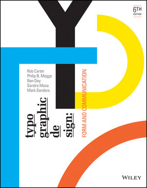
Week 9: Typographic Design: Form & Communication 6th Edition (Carter et al., 2015)
In the chapter Letterforms Analyzed under the Anatomy of Typography, the author discusses how letterforms evolved and how that has affected how we design those letterforms today. Typography evolved from handwriting, which is created by making a series of marks by hand; therefore, the fundamental element constructing a letterform is the linear stroke. The marking properties of brush, reed pen, and stone engraver's chisel influenced the early form of the alphabet. This produced a pattern of thick and thin strokes. Since the time of the ancient Greeks, capital letterforms have consisted of simple geometric forms based on the square, circle, and triangle.
The resulting vocabulary of forms, however, lacks several important attributes: optically adjusted proportions, expressive design properties, and maximum legibility and readability. The transition from rudimentary marks to letterforms with graphic clarity and precision id a matter of design. Because capital letters were carved into stone, these letters developed with a minimum of curved strokes due to the difficulty of cutting curved lines. Lowercase letters evolved with reed-pen writing which meant curved strokes could be written quickly and were used to reduce the number of strokes needed to write many characters.
In medieval times, horizontal guidelines were drawn to contain and align each line of lettering. Today, letterforms and their parts are drawn on imaginary guidelines to bring uniformity to typography. All characters align optically on the baseline. The body height of lowercase characters aligns optically at the x-height, and the tops of capitals align optically along the capline. To achieve precise alignments, the typeface designer makes optical adjustments.
Week 10: Typographic Design: Form & Communication 6th Edition (Carter et al., 2015)

One such example is that pointed and curved letters have little weight at the top and/or bottom guidelines; this can make them appear too short. To make them appear the same height as letters that terminate squarely with the guidelines, the apexes of pointed letters extend beyond the baseline and capline. Curved letterforms are drawn slightly above and below these lines to prevent them from appearing too short.
Another example is that in two-storied capitals and figures, the top half appears too large of the form is divided in the mathematical center. To balance these letters optically, the center is slightly above the mathematical center, and the top halves are drawn slightly narrower than the bottom half. Additionally, horizontal strokes are draw slightly thinner than vertical strokes in both curved and straight letterforms. Otherwise, the horizontals would appear too thick.
These are only a few of the various optical relationships that appear within a font. These adjustments are very subtle and are often imperceptible to the reader. However, their overall effect is a more ordered and harmonious appearance.

In the same chapter as the previous week, within the Anatomy of Typography, the author discusses the unity of design in the type font. Tremendous diversity of form exists in the typographic font. 26 capitals, 26 lowercase letters, 10 numerals, punctuation, and other graphic elements must be integrated into a system that can be successfully combined into innumerable words.
Letterform combinations demonstrate visual similarities that bring wholeness to typography. Letterforms share similar parts. Repeated curves, verticals, horizontals, and serifs are combined to bring variety and unity to typographic designs using this typeface. All well-designed type fonts display this principle of repetition with variety.

In the section Legibility, under the chapter Basic Principles of Legibility, the author discusses how letterforms affect legibility. Letters are basic to legible typography. The primary purpose of a letterform is to convey a recognizable meaning to the mind. Therefore, letterforms must be designed with clarity, each being distinct within the alphabet. The contrast among individual characters makes it possible for the reader to decipher written information without confusion.
The most legible typefaces are those timeless examples characterized by three qualities upon which legibility is dependent: contrast, simplicity, and proportion. These typefaces exemplify beautiful and functional letterforms. A close look at typefaces such as Garamond, Baskerville, and Bodoni will reveal why their forms are as vital now as when they were first designed.
The alphabet consists of 26 letters, each of which has evolved over the centuries to a unique place within this system of signs. As the alphabet has evolved, it has become a flexible system of signs in with all letters are distinct, yet all work together harmoniously as visible language.
In spite of the innumerable variations of size, proportion, weight, and elaboration in letterform design, the basic structure of each letterform must remain the same. For example, the capital A always consists of two oblique strokes joined at the top and connected by a horizontal stroke at the midsection. Sufficient contrast must exists between the letters in a font so that they can be easily distinguished.


Comments
Post a Comment