Advanced Typography - Task 1

05/04/2023 - 09/05/2023 // (Week 1 - Week 6)
Denise Anjali // 0342430
Advanced
Typography // Bachelor of Design in Creative Media
Task 1: Exercise 1
& 2
LECTURES
Week 1: Typographic Systems
According to Elam, all design is based on a structural system and they can be sorted into eight major variations with an infinite number of permutations. These eight major variations are: axial, radial, dilatational, random, grid, modular, transitional, and bilateral.
Week 2: Typographic Composition
When we think about composition, we think about the dominant principles underpinning design composition, which are emphasis, isolation, repetition, symmetry and asymmetry, alignment, perspective to name a few. However, these abstract notions seem ambiguous when it comes to translating it into typographic layouts or composition.
Repetition in a typographic setting would serve to emphasise the outlier to the repetition.
The Rule of Thirds is a photographic guide to composition, it basically suggest that a frame (space) can be divided into 3 columns and 3 rows. The intersecting lines are are used as guide to place the points of interest, within the given space. Realistically, no one would ever use the rule of thirds when there are other more favourable options.
From the 8 typographic systems, the most pragmatic and the most used system is the Grid System. While the Grid System may seem to be old or rigid, the versatility of the system and its (to some degree) modular nature tends to allow an infinite number of adaptations.
In reaction to this very ordered approach to Typography of the modernist era, the post-modernist era in
Other models:
Environmental Grid: This system is based on the exploration of an existing structure or numerous structures combined. An extraction of crucial lines both curved and straight are formed. The designer then organizes his information around this super-structure, which includes non-objective elements to create a unique and exciting mixture of texture and visual stimuli.
Form & Movement: This system is based on the exploration of an existing Grid Systems. The placement of a form (irrespective of what it is) on a page, over many pages creates movement. Whether the page is paper or screen is irrelevant.
Week 3: Context & Creativity
Cuneiform, the earliest system of actual writing. Its distinctive wedge form was the result of pressing the blunt end of a reed stylus into wet clay tablets. The cuneiform characters evolved from pictograms.
The Egyptian writing system (Hieroglyphics) is fused with the art of relief carving. The system was a mixture of both rebus and phonetic characters—the first link to a future alphabetic system.
Built on the Egyptian logo-consonantal system, the Phoenicians developed a phonetic alphabet consisting of 22 letters. The Phoenicians system then was adopted by the Greeks who added the necessary vowels. These early Greek letters were drawn freehand, not constructed with compasses and rule, and they had no serifs.
In time, the strokes of these letter grew thicker, the aperture lessened, and serifs appeared. The new forms served as models for formal lettering in imperial Rome. Those Roman inscriptional letters have served in their turn as models for calligraphers and type designers. By the 4th century, Roman letters (Roman uncials) were becoming more rounded, the curved form allowed for less strokes and could be written faster. In England, the uncial evolved into a more slanted and condensed form.
After the fall of the Roman Empire, the end of a central advanced culture resulted in general illiteracy and a breakdown of handwriting into diverse regional styles. During Charlemagne's patronage book production increased and language was standardized —capitals at the start of a sentence, spaces between words and punctuation. A new script emerged, the Carolingian minuscule. The Carolingian minuscule was as important a development as the standard Roman capital—for it was this style that became the pattern for the Humanistic writing of the fifteenth century; this latter, in turn was the basis of our lower-case roman type
Gothic was the culminating artistic expression of the middle ages. Blackletter is characterized by tight spacing and condensed lettering. Evenly spaced verticals dominated the letterform.
The Humanist admired the Carolingian script , which had clear open handwriting. Humanist named the newly rediscovered letterforms Antica. Analysis of form resulted in a more perfect or rationalized letter.
Printing (wood block) had already been practiced in China, Korea and Japan. China attempted to create moveable type but failed in part due to the vast number of characters. Several decades before the earliest printing in Europe (Guttenberg’s bible 1439), the Koreans establish a foundry to cast movable type in bronze with the creation of their new script Han'gul.
What is important to note is that later day typographers, through research, curiosity and a respect for history would pay homage to these developments. With the digital revolution, the west would begin to digitize many of its historical creations and type foundries would create, market and sell or license them.
With the colonization of the east by the west, much of the heritage and cultural practices in literature, arts and crafts, languages and scripts would be halted or stunted.
Indonesia's most important historical script: Kawi. Based on Nagari, but indigenous to Java. It was the script used for contact with other kingdoms. Because it was so widespread, Kawi became the basis of other scripts in both Indonesia and the Philippines. This means that ancient kingdoms in of the Malay Peninsula would have been using both Indian scripts and Kawi to write old Malay language.
Jawi, the Arabic-based alphabet. We all know Jawi was introduced along with Islam. Ancient Hindu societies in both South and Southeast Asia were classist and often caste-based. The lower classes were generally illiterate. When Islamic traders engaged in missionary work, they would have taught Jawi to people that might otherwise not have learned to read and write. This allowed it to spread among the upper and middle-class in the trading ports. However, it took a while for Jawi to supplant other scripts, and in some areas never did so completely.
More vernacular scripts are being produced by software giants (Google): in their employment a great many Asian programmers and designers. More and more vernacular and “multi-script” typefaces are being produced to cater to situations where the written matter is communicated in the vernacular script or vernacular and Latin scripts. In Malaysia, there is murasu.com, spear-headed by programmer and typographer Muthu Nedumaran. The programming language needed to encode the different types of vernacular writing systems was cracked by Muthu.
In South East Asia, the movement has not organized and coordinated itself well enough. Creativity and originality are properties that are most often intertwined. It is important for young designers to look inward and examine their histories, civilization, culture and communities to bring these past developments into the future and develop on them instead of blindly appropriating cultures and developments that have no context, relatability or relevance. Creativity and inspiration should begin by observing our surroundings and exploration of our collective histories.
Week 4: Designing Type
Some examples of purpose and limitations behind typefaces:
Frutiger
Purpose: The goal of this new typeface was create a clean, distinctive and legible typeface that is easy to see from both close up and far away. Extremely functional.
Considerations/Limitations: letterforms needed to be recognized even in poor light conditions or when the reader was moving quickly past the sign. He tested with unfocused letters to see which letterforms could still be identified.
Verdana
Purpose: the font was tuned to be extremely legible even at very small sizes on the screen due in part to the popularity of the internet and electronic devices.
Considerations/limitations: The Verdana fonts exhibit characteristics derived from the pixel rather than the pen, the brush or the chisel. Commonly confused characters, such as the lowercase i j l.
Johnston Sans
Purpose: London's Underground railway ordered a new typeface for its posters and signage from the calligrapher Edward Johnston. He handed over details and examples of letter shapes that would set the tone for printed text until the present day.
Consideration/limitation: Johnston's remit was to unite the London Underground Group, the different companies all using the same rails and tunnels. Johnston applied the proportions of Roman capital letters to his typeface, so it was rooted in history, rooted in traditional calligraphy. But it has an elegance
and a simplicity that absolutely fitted the modern age.
Research: When creating type, we should understand type history, type anatomy and type conventions. We should also know terminologies, side-bearing, metrics, hinting. It is then important to determine the type’s purpose or what it would be used for. We should also examine existing fonts that are presently being used for inspiration/reference/context/usage pattern/etc
Sketching: Some designers sketch their typeface using the traditional tool set (brushes/ pens, ink and paper) then scan them for the purpose of digitization. They are more confident with their hands and have better control using it. Some designers sketch their typeface using digital tool sets, such as Wacom directly into a font design software (much quicker, persistent, and consistent) but this can sometimes impede the natural movement of hand strokes.
Digitization: There are professional software that are used in the digitization of typefaces, amongst the leading software are: FontLab and Glyphs App. There are designers that also use Adobe Illustrator to design or craft the letterforms and then introduce it into the specialized font apps. Attention should not only be given to the whole form at this stage but also to the counter form. The readability of the typeface is heavily dependent on it.
Testing: The results of the testing is part of the process of refining and correcting aspects of the typeface. Prototyping is also part of the testing process and leads to important feedback. Depending on the typeface category, the readability and legibility of the the typeface becomes an important consideration. However, it is not as crucial if the typeface is a display type, where expression of the form takes a little more precedence
Deploy: Even after deploying a completed typeface there are always teething problems that did not come to the fore during the prototyping and testing phases. The rigour of the testing is important in so that the teething issue remain minor.
Using grids (with circular forms) can facilitate the construction of a letterforms and is a possible method to design your letterform.
Construction and considerations:
An important visual correction is the extrusion of curved (and protruding) forms past the baseline and cap line. This also applies to vertical alignment between curved and straight forms. A visual correction is also needed for the distance between letters. The letters must be altered to a uniform ‘visual’ white space. This means that the white space between the letters should appear the same.
Most typefaces come about due to a need or demand. The need/motivation can be intrinsic and extrinsic.
Intrinsic - the designer has an inexplicable need driven by interest to design a typeface, and seeks out a form that comes close to fulfilling a desire. It is also possible that the designer identifies a gap/problem and thus endeavours to solve it through the design of the typeface.
Extrinsic - the designer has been commissioned or the student-designer has a task to complete that involves designing a typeface.
INSTRUCTIONS
Exercise 1 - Typographic Systems
The first part of this task was to create layouts for all 8 typographic systems using the text provided to us. We were given a choice between 3 titles to use in the work. In line with the systems, we also had to express the title in the layouts. We had to complete this work in Adobe InDesign, on 200mm x 200mm pages.
We attempted the axial system during class. Here are my first attempts that were created in class.


I tried out more axis orientations to create more interesting layouts. I struggled to understand how to balance aesthetic and technical compliance when it came to the axial system.


From the feedback given to me by Mr Vinod and my peers, I made adjustments to the relevant layouts.


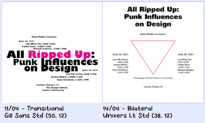
Final Typographic Systems Layouts (JPG)


Exercise 2 - Type & Play


Image 2.1 & 2.2: Reference image and extracted lines from the image, Week 3 (20/04/2023)


The second part of the exercise was to integrate the refined letterforms within an image to create a sort of poster that was 1024 x 1024 pixels large. I found the image below on Pinterest.


After feedback, we're told to improve the poster due to it not looking like a movie poster. The letterforms are also too blended into the background. I changed my poster as instructed.


FEEDBACK
Week 1
General feedback: Avoid forced small capitals, the stroke width will be different. Watch out about how it looks optically, not just technically. Think about balance but avoid symmetry as it reduces dynamism. Think about aesthetics as well as the technical adherence to the systems.
Specific feedback: It adheres to an axial structure but does not draw attention or interest. Lacks visual impact and does not express the title well. The right layout is not anchored and is floating in the white space.
Week 2
General feedback: Spacing should be consistent, equalise the spacing in order to balance the space. In compositions, information close to the edge creates tension and can draw attention out of the layout. Understand human eye flow and try to draw the viewer's eye back to the work. Design around the most important element. Alignment can help link elements together.
Specific feedback:
Dilatational : could use font that is differentiated inside and outside the radius to enrich its visual texture.
Radial : should be scaled up, the other side of the page is too empty. Would work if the layout is in the center bottom however..
Bilateral : should have the triangle graphic be an outline, adjust the leading/paragraph spacing, fix the design school text (has confusing read), when using bold text check its spacing when viewed from afar.
Axial : heading readability is confusing, also font weights aren't varied enough. The spacing overall is very inconsistent, between lines and between columns. Make the axis more prominent. Graphics are not suitable, colour maybe too jarring, shape may be too wide, should have a more strategic placement.
Modular : graphics are too distracting, they should only serve to enhance. The headline is not connected, confusing and is failure to communicate.
Grid : circle is too large and isn't necessary (form follows function). Texture of the text is rather monotonous. Avoid a mass of small text and have depth in the text.
Random : All the text is the same, add variety and texture. The graphics are too distracting and repetitive. Strive to have legibility even in this system.
Week 3
General feedback: Don't lose the extraction image's characteristics. Don't be bound by the initial extraction but must adhere to the characteristics of the extraction. Extraction should be true to the image.
Specific feedback: Extract more from the image. Incorporate both the straight lines and the frills. Letters extracted are too simple.
Week 4
General feedback: The challenge is to set the letters within the image but make it integrated within the image.
Specific feedback: Refinement okay. Image is unrelated to extraction source.
REFLECTION
Experience: These exercises were challenging as I found that the more
freedom we had to experiment with both typographic system layouts and
the letterform extraction led to a paralysis of choices. I found that I
did not know where to start and had to frequently look at senior's work
to understand the steps that they went through.
Observations:
I noticed that I should look back at the beginning of my work more, to
avoid going too far off track. I struggled with the poster for exercise
two because of this even though it greatly helped me to look at punk
inspiration for exercise one.
Findings: I found that I should
ask for the feedback of the people around me more as well, to treat them
as potential clients. This would give me more insight into how people
would view my work without any context.
FURTHER READING
Week 1: Typographic Systems (Elam, Kimberly, 2007)

In the introductory section of the book, Elam explains that an understanding of systems of visual organization gives the designer an in-depth knowledge of the design process. It is possible for the designer to use a more fluid means to create typographic messages through the eight systems of typographic organization. The approach to a process-orientated exploration of systems of visual organization is focused and simple. The designer is challenged to use each system in the development of a type message. The same eight-line message is used in all of the compositions in order to focus attention on the variations in the visual organization system. Each pf the systems has a distinct aesthetic and visual language. The systems lend themselves best to interpretive communication, whereby the designer has considered the message tone, structure, length, and meaning. Therefore, the typography blends with the message to become an image. All lines of the message must be used in each composition. However, lines may be broken at will and leading, word spacing, and letter spacing are all variable which creates distinct changes in grouping, position, textures, and tone.
Week 2: Typographic Systems (Elam, Kimberly, 2007)
A summary of the description of each typographic system by the author:
The axial system is one of the simplest systems. All elements are organized either to the left or right of a single axis. Experience working with the axial system reveals that asymmetric arrangements are often more interesting than symmetrical ones. The use of asymmetry results in a relatively simple visual arrangement with heightened visual interest. The axial system is easily understood and helps the designer develop a keen awareness of grouping, word space, letter space, leading, and composition.
In the radial system, all elements are organized to extend from a central point of focus like rays. The compositions are dynamic as the eye is drawn to the focal point (implied or depicted) of the radial composition. In order to create a functional message, the lines of text should be arranged in the most comfortable manner possible. The radial system presents a compositional challenge because each line readily exists as an individual unit with a relationship only to the focal point. Further experience with the system often yields interesting groupings of lines, simplified compositions, and more dense textures. However, radial compositions are difficult to read and are most appropriate for visual messages with limited amount of text.
In a dilatational system, circles dilate or expand from a central point. Similar to the radial system, The compositions are dynamic as the eye moves along the arc of the circle or is drawn to the focal point at the center of the circle. Even short visual messages are difficult to control in the dilatational system. Text that is arranged in the dilatational system can easily be turned upside down or placed in an awkward position for reading. The designer needs to be constantly aware of reading comfort during compositions. Compositions can readily become complex and grouping of elements is often needed to simplify the message and consolidate visual forces. The most readable dilatational compositions bring a sense of order to the text through composition.
The random system consists of elements that are arranged without definite aim, pattern, direction, rule, method, or purpose, but it is deceptively simple because the viewer imposes organization on compositions even when it is unintentional. Work is often begun by scattering elements in the compositional field with free abandon. Surprisingly, random placement often yields a very dynamic and spontaneous result, that although difficult to read, is visually satisfying. Multiple angles immediately impart a sense of randomness and the more dramatic and varies the angles, the stronger the random sense. Overlapping and cropping are natural occurrences in compositions with multiple angles and are some of the strongest random cues. Intentional typographic compositions designed to communicate rarely overlaps or is cropped because readability is often inhibited. Texture variation also assists in the creation of random compositions. It is valuable in this system to make the composition abstract by regarding the lines of text as texture only, and not as elements of communication.
A grid is a system of vertical and horizontal divisions that organize and create relationships between elements. The objective in organizing visual communication with the grid system is to develop strong interrelationships between the typographic elements and recurring rhythmical proportions of text blocks, images, and space. The grid system gives the designer an opportunity to explore horizontal composition in more familiar and orderly ways. Similar to the axial system, the grid system depends on alignment but differs in that there is more than a single axis.
The transitional system of visual organization is an informal system of layered and shifted banding. This is a far more casual system than the grid system in that strict interrelationship through edge alignment is not desirable. The lines of type are free flowing and the textures they create assist in ordering the message. This systems often results in compositions that echo fine art in that many have the visual feel of a landscape. The transitional system is the most informal and relaxed system because the elements are not required to align on any axis. The most difficult aspect of the system for most designers is overcoming the need to interrelate elements through alignment. Instead, elements are related through the massing of texture and the shapes of those textures on the page. The beauty of the transitional system is in its natural asymmetry. While readability is diminished, careful control of the text tone and placement can create a message that communicates.
The modular system is dependent on the standardized non-objective elements or units that act as a ground to hold and contain text. Compositions are created by the organization and placement of the modular units. The idea is to standardize the unit on which the typography rests and then compose the message with the modules. Modules take the place of non-objective elements, and the designer is challenged to design with modular shapes at the outset. Early compositions often contain stand alone modules, but as work progresses modules begin to touch, overlap, and combine so as to create other interesting shapes.
The bilateral system is the most symmetrical of the visual organization systems. It consists of a single axis with lines of text centered on the axis. As the most symmetrical system, the bilateral system is the most challenging compositionally. This is due to the inherent symmetry that makes these compositions predictable and potentially uninteresting. There is beauty in symmetry , the hallmark of the bilateral system. However, designers rapidly cycle through the expected variations of symmetrical composition and experiment with differing shapes of text blocks; the resulting compositions feels traditional and somewhat static. Placing the bilateral axis off center opens new venues of composition. This system inspires the designer to seek creativity with the organization of space and the simple elements of line breaks, spacing, and asymmetrical placement of the bilateral axis.
Week 3: Letterforms: Typeface Design from Past to Future (Samara, Timothy, 2018)

There is a section in the book labelled 'Strategies and Processes to Help Guide the Budding Designer' which begins on page 125. The author begins with an introduction: whether the plan is for a complete text or display face, or a finite set of letters as a brand wordmark, the first thing is to get comfortable with making letters by hand. Hand-drawing simultaneously builds manual control and visual sensitivity to form while working to achieve the desired goals previously described. Deciding on a particular style follows; then a process of defining its characteristics; and, ultimately, adjusting them, character by character, until all within the set appear visually related.
Before starting, it is important to start by exercising eye & hand by learning to write again. Day to fay writing is so second nature that properly forming archetypal, alphanumeric characters prove surprisingly difficult for many younger designer because they don't often do much physical writing – mostly typing. Drawing fuses neural pathways between input (seeing) and output (making) – through practice, analysis and intuition become one, effectively allowing the maker to physically feel what is seen and to see what is felt, on the fly, as it is happening in real time.
In looking for an idea to pursue, one might uncover a rarity: an obsolete, custom drawn logotype; a specimen cast only in lead and never digitized; or one that appeared as a headline in an old catalog, but was never seen again. As cultural aesthetics change over time, typefaces of one style or another inevitably, go out of fashion. Reviving a disfavoured style, or one that enjoyed only limited use, can be especially fulfilling, and the results may resonate with contemporary audiences. In the end, nothing beats methodical exploration as a way of identifying interests. Beginning with a rote investigation of basic characteristics can help corral overwhelming possibilities into more finite categories for consideration. In working this way, one discovers very quickly what one really does and does not like.


Comments
Post a Comment