Advanced Typography - Task 2 (A+B)
26/04/2023 - 31/05/2023 // (Week 4 - Week 8)
Denise Anjali // 0342430
Advanced Typography // Bachelor of Design in Creative Media
Task 2: (A) Key Artwork & (B) Collateral
LECTURES
Weeks 1 - 4:
Link to previous blog post with lectures
Week 5: Perception & Organization
Dair posits 7 kinds of contrast: 1. Size, 2. weight, 3. contrast of form, 4. contrast of structure, 5. contrast of texture, 6. contrast of colour and 7. contrast of direction.
Size
A contrast of size provides a point to which the reader’s attention is drawn. The most common use of size is in making a title or heading noticeably bigger than the body text.
Weight
Weight describes how bold type can stand out in the middle of lighter type of the same style.
Form
Contrast of form is the distinction between a capital letter and its lowercase equivalent, or a roman letter and its italic variant; condensed and expanded versions of typeface are also included under the contrast of form.
Structure
Texture
Texture refers to the way the lines of type look as a whole up close and from a distance. This depends partly on the letterforms themselves and partly on how they’re arranged.
Direction
Contrast of direction is the opposition between vertical and horizontal, and the angles in between. Turning one word on its side can have a dramatic effect on a layout. Text blocks also have their vertical or horizontal aspects of direction. Mixing wide blocks of long lines with tall columns of short line can also create a contrast.
Colour
The use of colour is suggested that a second colour is often less emphatic in values than plain black on white. Therefore, it is important to give thought to which element needs to be emphasized and to pay attention to the tonal values of the colours that are used.
Form
Form refers to the overall look and feel of the elements that make up the typographic composition. It is the part that plays a role in visual impact and first impressions. A good form in typography tends to be visually intriguing to the eye; it leads the eye from point to point, it entertains the mind and is most often memorable.
When a typeface is perceived as a form, it no longer reads as a letter because it has been manipulated by distortion, texture, enlargement, and has been extruded into a space.
Gestalt
Gestalt Psychology is an attempt to understand the laws behind the ability to acquire and maintain meaningful perceptions. Gestalt theory emphasizes that the whole of anything is greater than its parts—this is based on the idea that we experience things as unified whole. Therefore in design (read: typographic layouts), the components/ elements that make up the design is only as good as its overall visual form. While each component may be functional at an elemental level, the sum of its parts is not greater than the whole or the overall form.
Gestalt: Perceptual Organisation / Groupings
Law of Similarity - gestalt grouping law that states that elements that are similar to each other tend to be perceived as a unified group.
Law of Proximity - gestalt grouping law that states elements that are close together tend to be perceived as a unified group.
Law of Closure - the mind’s tendency to see complete figures or forms even if a picture is incomplete, partially hidden by other objects, or if part of the information needed to make a complete picture in our minds is missing.
Law of Continuation - humans tend to perceive each of two or more objects as different, singular, and uninterrupted object even when they intersect.
Law of Symmetry, Law of Simplicity (Praganz), etc
Organisation of information in the form of laying out complex content in a hierarchical manner requires practice and the knowledge gained herein but also elsewhere. Knowledge obtained from reading, listening and viewing must be exercised or put to use for it to be retained and of standard.
INSTRUCTIONS
Task 2A: Key Artwork
For this task, the first hurdle was to create something which would represent me. Personally, I've always found this to be a very difficult thing to do whether it be in words or in an artwork. I ended up starting with sketches of my signature and trying to make that more readable. I also tried to create a more cartoonish style that would mimic the shape of my surname in mandarin '陈' but it did not translate well. Those are the sketches in the top row of the image below.
While I was now on a better track, it still was not good enough to be a key artwork. I went back to sketching and created a larger variety as seen in the image below with a variety of meanings. The top half of the page focused on stamp-like sketches or inspired by cute logos on Pinterest. The lower half of the page had sketches that aimed to incorporate the 'angel' aspect of the key artwork and have a more cute and cartoonish look. This is because my style is heavily influenced by cartoons that I grew up watching and I still watch many cartoons to this day.
After settling on the black and white version, we had to start introducing colour. The colour palette has to be approved and not be overly pastel in order to take into account the visibility of the logo on light backgrounds.
Final Task 2A Submission
After deciding on the logo and the colours colours, it was onto creating the collaterals. I started by animating the key artwork. Initially, I planned to create the animation using Illustrator and Photoshop, which would require me to create my frames in Illustrator. I planned it by sketching positions and where the key artwork would move.

Image 2.2: After effects animation screenshot, Week 8 (21/05/2023)
Before creating the other collaterals, we were told to explore how we could extract elements from the key artwork which could be incorporated into them.

Image 2.6: Extraction from key artwork, Week 8 (23/05/2023)

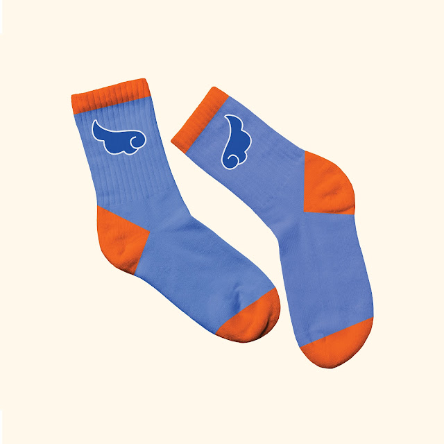
Image 2.12: Socks mock up, Week 8 (24/05/2023)

Image 2.13: Beanie mock up, Week 8 (24/05/2023)
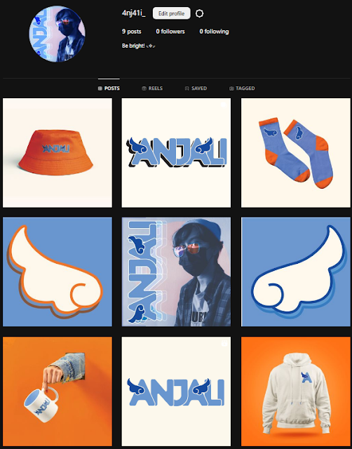
Before posting the gif, I had to save it as an mp4 when I found out that gifs can't be posted. Below is the final Instagram layout.
Link to Instagram profile: @4nj4li_
FEEDBACK
Week 5:
When evaluating own and peers' work, consider:
1.
Does it represent the person symbolically or creatively?
2.
Is it readable and legible?
3. Does it look well
crafted?
4. Does it look like a logo?
5. Is there a
good balance of negative and positive space?
6. Is there
unnecessary use of non-objective elements?
General feedback: When creating the mark, think about whether is its distinct,
meaningful and memorable. Consider if someone would wear it.
Specific feedback: Try using different types of brushes with various textures when
sketching. Most of my sketches are not easy to recreate, lacks memorability.
Some sketches are meaningful but not distinct enough.
Week 6:
General feedback: Think about what is the meaning behind the wordmark. Monograms are not as simple as they seem. If going with monogram, minimum 3 letters. When thinking of the word that describes the artwork, makes sure that it relates to the design.
Specific feedback: For the 'Denise' sketch, it looks very childish so must make up for it with a good construction of the letterforms. For the 'Anjali' sketch, the idea of the wings on the A works well, can explore more. The halo does not seem necessary.
Week 7:
General feedback: Decide on a colour palette, have 1 strong colour in the logo. Don't just slap the logo on the collateral, make it look realistic and think on how to expand your identity. Can break the identity down to use but cannot change the overall structure of the mark (breaking the integrity of the identity).
Specific feedback: Taught how to combine the outlines to create a whole shape.
Week 9:
General feedback: Avoid overuse of a colour, think further on how to expand the identity. Expand the style of the motif into the collateral, not just repeat the logo but apply the characteristics of the logo.
REFLECTION
Experience: Given the amount of introspection required for this task, it is no wonder it can take years for designers to come up with a branding for themselves that they are satisfied with. To compress yet express myself in the key artwork was difficult but eventually it was satisfactory enough to move on.
Observations: I learnt that there are many paths to the same destination. Learning about mock up templates was a game changer for me and allowed me to create higher quality results in lesser time than by manually tweaking it on Illustrator.
Findings: It is prudent to plan well as I did not. I found it difficult to link all the collateral to the key artwork yet stay on brand and aesthetic. While staying on colour scheme may be simple, keeping true to the core of the brand when I wasn't too clear on all the meanings behind the brand was a challenge for sure. In the end, I basically went with things that I like.
FURTHER READING
Week 5: Thinking with Type (Lupton, Ellen, 2004)
On page 53 of the first section of her book, the author explains logotypes. Logotypes use typography or lettering to depict the name of an organization in a memorable way. A logotype uses letters to create a distinctive visual image. Logotypes can be built with existing fonts or with custom drawn letterforms. Modern logotypes are often designed in different versions for use in different situations. A logotype is part of an overall identity program, which the designer conceives as a 'language' that lives (and changes) in various circumstances.


Comments
Post a Comment